I’m not sure how cover creation works for other publishers or for self-publishers, but I can share with you my process.
At the beginning of our partnership, my publisher asked me to fill out a questionnaire about the cover and turn it in with the completed manuscript. Were there images that would be appropriate? I suggested anything that symbolizes union: the Tao symbol (my Twitter avatar), joined hands, joined hearts, puzzle pieces coming together, and rainbow colors for promises kept. I didn’t know how the publisher would build a cover with that input.
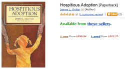
[I really like the image on Jim Gritter’s book, Hospitious Adoption, as well as the content in it (wow! currently selling on Amazon for $900!). But Jim got it first.
Still, for my own book I had nothing definitive in my mind, no clear vision of what the book should look like. I am much more facile thinking in words than in pictures, so I’m glad I had access to the publisher’s expertise in this part of book production.
The questionnaire also asked if there were any images that should be avoided. I nixed babies. This book isn’t about parenting just babies. And I don’t want it to attract only people who are at the very beginning of their adoption journey. It really should have wider appeal — it’s also for parents of toddlers, gradeschoolers, tweens and teens. It’s got messages for birth families as well as adoptive families. And there’s a chapter for why and how to have openness in foster situations, international adoptions and parenting by donor gametes — even in cases in which “openness” doesn’t mean actual contact.
I sent the questionnaire along with the manuscript at the end of the summer. And waited for the publisher to work its magic.
Two weeks ago the publisher sent me five options. Four of them had templates based on squares and were very grid-ish. But one was more orb-ish in flavor. In my mind, circles portray wholeness and integration better than do squares. So my gut feeling on choosing The One was clear and instantaneous.
And so — we now have a cover for the book.
Voilá!
If you like it, tell me. If you don’t, there’s nothing I can do — so instead tell me who is your favorite political theorist of the European Age of Enlightenment and why.
Without Googling.*
* generic term for all Internet searches.


36 Responses
I don’t like it….. I LOVE it!!!!!
Whew!
Or, you just don’t want to write an essay 😉
I LOVE IT!!! And I really enjoyed learning about the process to get to this point with the cover. So interesting and exciting! Congrats! 🙂
I love it, too! Somehow it’s completely real to me now … though I’m sure it was completely real to YOU a lot longer ago! 🙂 Congratulations!!
congratulations!!
I especially like the color blend and circular graphics. it’s calming yet warm.
I also enjoyed reading about the process by which it emerged.
now amazon needs to add the cover image! how do you make that happen?!
The publisher works with Amazon on the book’s page. I believe this is in progress…
Thanks for the link to a more affordable option for Jim’s book!
I was, however, able to add the image to my Amazon Author page: http://www.amazon.com/authors/loriholden
“In my mind, circles portray wholeness and integration better than do squares.”
I <3 circles – and I LOVE your cover! Mazel tov! And I love how they got the rainbow gradient going on… it's just so YOU, Lori! Yay!! *clapping hands like a little kid*
And, b/c I'm a nerd (not b/c I don't like your cover): What is Voltaire? Is that right Alex? Fighting the urge to Google.
Daily Double!
Also: Asian babies are the CUTEST babies.
How cool! Congratulations, and an internet high five 🙂
Good thing I like it – I don’t know much about political theorists.
oh, and btw, I am fond of john locke, though more for his theory on social contracts than tabula rasa — while I think experience does in fact build knowledge, I don’t think we’re born as complete blank slates.
Agreed. I like Locke, too. If only for the “L.”
laughing here, voltaire!
Luckily, I do love it 🙂 Congratulations. It is a fabulous, vibrant cover.
Hearts. I will need a review copy for our Canadian Adoptive Families magazine! Woop! Exciting.
I’ll make that request. Would you email me your mailing address?
Thank you!
Congratulations! So excited to see all your hard work coming to fruition.
It is a beautiful cover—warm, inviting, and perhaps most important, real. Congratulations.
It’s beautiful! Congratulations…
I love it – and my favorite yada-yada Enlightenment yada-yada is John Locke.
Why? Because it was the only name I could pull out of the fog in my brain that I was sure would actually fit the category!
Pure awesomeness. And yup – I partially love it because I didn’t want to have to write an essay, especially since politics and anything related just aren’t my thing. 😉 Congrats! Can’t wait to read it! 🙂
I like it. I think the colors balance nicely…the font color of the title with the stripe down the right-hand side. But the thing I like best about it is the slightly blurred, differing opacity, some over-lapping/some not over-lapping BUBBLES (for lack of a better word).
I love it! It’s so *you*, and that’s important.i would definitely be skeptical of a book with your name on it if the cover was all squares.
And so cool that you’re sharing your cover and the story behind it right when I’m about to start designing mine for my NaNoWriMo novel!
Oooh, I love it! It’s so effervescent. 😀
Whew, I’m so happy I love it because I can’t do much without Google these days.
I know I told you early on, before meeting you IRL and before friendship, how much I love your Twitter avatar. Soothing, continual, inviting to follow. I love the circle analogy. The circle of life, a life complete, whole. You can choose whom to include inside and keep outside your circle. Beautiful, my friend.
I like it very much!
Congratulations on a beautiful cover.
I love the cover!!! Well done, Lori! And congratulations on this final step.
I think it’s a beautiful cover. Well done!!!
Love the colors – love the circles. Congrats on another step done!
It’s beautiful and vibrant … just like the authors! LOVELOVELOVE! 🙂
Super, super exciting. Congratulations, having a cover makes it all the more “real.” Can’t wait to read!
Laura
LOVE the circles and the colors. It portrays exactly how you approach everything I think! Can’t wait for the release!
Love it–it’s perfect.
Super, super exciting. Congratulations, having a cover makes it all the more “real.” Can’t wait to read!
Laura